Redesigning the Explore Page in the Fly Delta App
For this personal development project, I chose to redesign the current explore page into a new home page on the Fly Delta mobile app in Figma. This redesign will highlight upcoming flight and boarding pass information to improve user interaction and accessibility.
The Problem:
When it comes to the current Fly Delta mobile app, users mostly use it to access their flight information/boarding pass and for easy use when traveling. However, there is confusion on what page holds flight information because there are too many page options in the bottom navigation bar. Additionally, the app has a main page that users are directed to after logging in called “Explore” which consists of only advertisements. The questions users have when navigating the app include:
How many Delta miles do I have?
What time do I have to board my flight?
What gate do I have to go to board my plane?
Where can I download my digital boarding pass to my phone?
These questions can all be answered from 2 out of the 5 current pages in the current Fly Delta mobile app: Trips and Accounts.
So, what’s the point of an “Explore” page?
The Solution:
According to the Delta website, the Fly Delta app was created to “book a flight, navigate the airport with interactive maps, track your bags and more — only with the Fly Delta app.” This may be true however the masses that currently use the app have it to access flight information mostly. Due to the questions users are asking, a main “Home” page with direct access to all upcoming flights and flight information is the best course of action to take for users to easily navigate the app. Combining the “Trips” page and “Explore” page is the plan. Excluding pages, like “Explore”, that aren’t necessary, is imperative to better the user experience. This leads into my persona.
The Persona
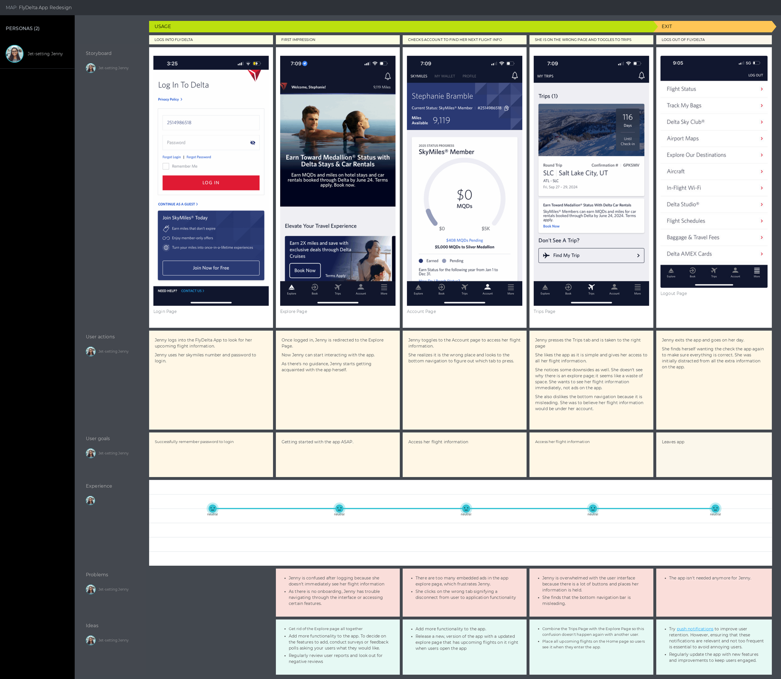
My persona is representative of the largest user group, consisting of 35% of 30–49 year olds, who travel with Delta. Jet-setting Jenny is a 32 year old female working as a Senior Business Consultant in NYC. She values her time very much so she insists that the information she needs is at her fingertips which is why she has the Fly Delta app. But as the customer journey map details, she ends up feeling distracted, annoyed and anxious while using the app.
Customer Journey Map
When creating my customer journey map, I decided the best way to showcase Fly Delta’s inconsistencies was to show the app in it’s current state. I wanted to show it like this because seeing Jenny’s struggles is a powerful representation of the lack of empathy the Fly Delta app has for their users. It only takes 1 or 2 users to have a problem to know that other people are experiencing these issues as well.
Below, in the first 2 rows, you see the state of the app and the user(Jenny) actions. Then, the story board visualizes her actions to show you where in the app she goes. Lower down, the customer journey map takes you through Jenny’s thought process and even her emotions throughout the experience. The emoticons were used in the map because research has shown that humans respond to them as they would a human face.
Bottom Navigation Bar
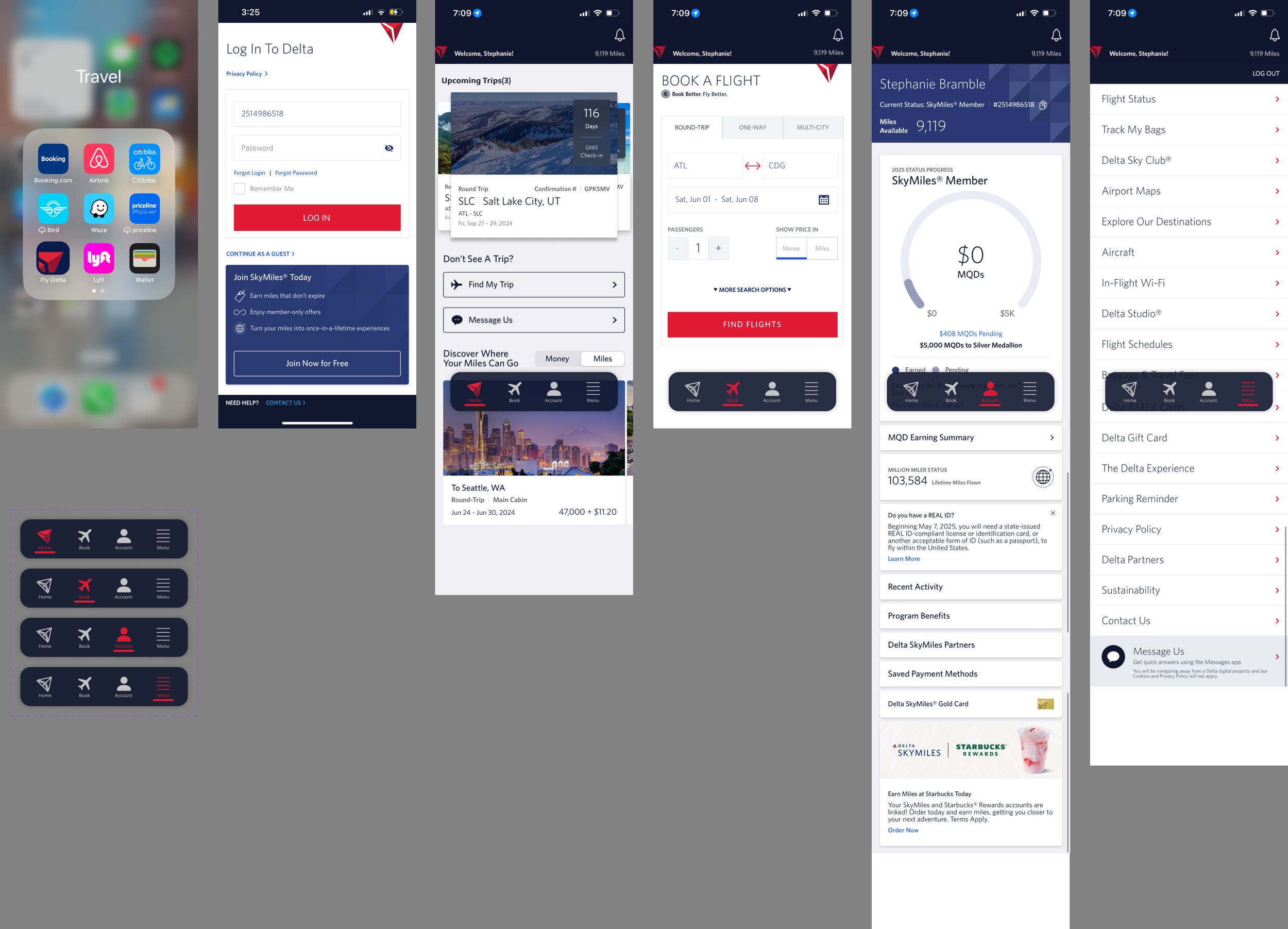
In addition to the redesign of the home page, I had to consider how the bottom navigation bar would differ when the “Trips” page was combined with the “Explore” page to create the “Home” page. In the effort to keep the noice of the navigation bar down and the users cognitive load low, I made the bar a floating and fixed element with 75% transparency. This gave the look of the navigation bar one of professionalism and simplicity.
Accessibility
In terms of accessibility, I want users to know what page they are on by looking at the bottom navigation bar, regardless of whether they have a visual impairment. Inclusivity is important in my designs, so I wanted to implement a navigation bar with the page icon that is highlighted when a user is currently on that page.
Icons & Colors
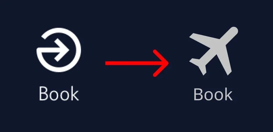
The icons chosen for the bottom navigation bar was kept similar to the original user interface expect for the “Home” and “Book” page. Because I combined the “Explore” page with the “Trips” page, I used the original Delta logo and used it as the redesigned“Home” page icon but tilted it. The colors chosen for the bottom navigation bar matched the Delta Air Lines Logos & Brand Guidelines.
Prototype
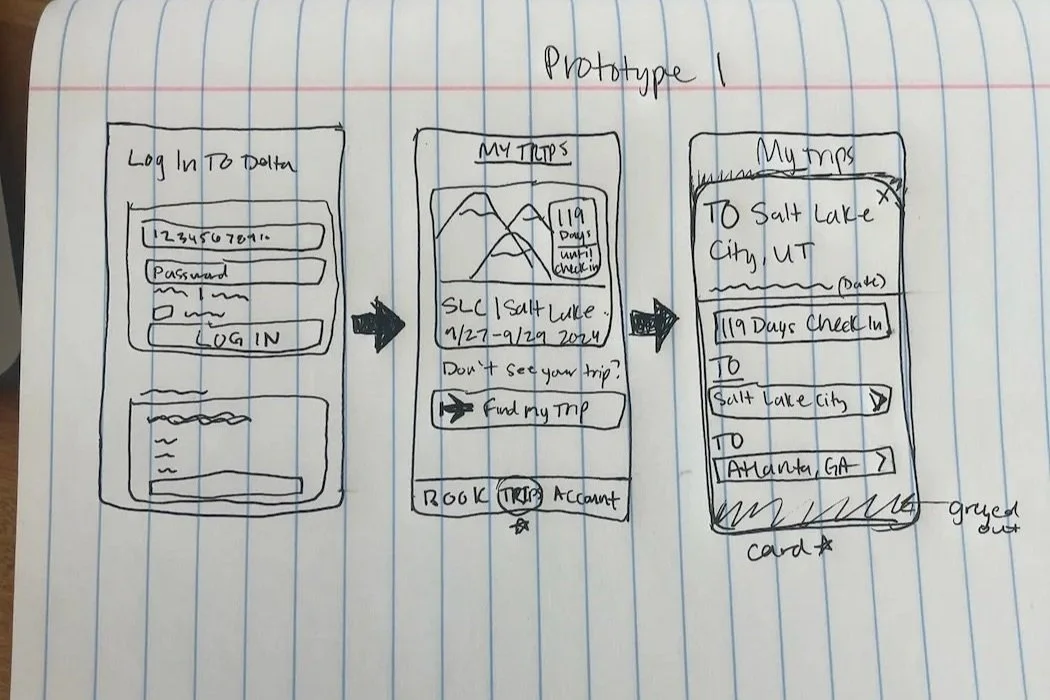
My prototype was developed iteratively alongside my customer journey map. I started with a rough paper and pen sketch in a composition notebook to explore ideas for the redesigned home page. Sketching by hand allowed me to experiment freely and keep the design flexible. After identifying the most successful elements from the paper prototype, I then translated them into a more polished and interactive prototype using Figma. This allowed me to refine the design and test it with potential users.
One of my top careers goals is to create easily accessible and understandable designs. Through further exploration of design tools Figma and UXpressia, I created a empathetic alternative for the Fly Delta mobile app that enables users to have their wanted information at their fingertips.
Building the customer journey map in UXpressia was a challenge but helpful. I altered the user actions many times to show how users really use the app. Creating it changed my perspective on design because I was able to use a persona to take bias out of my perspective. UXpressia’s journey mapping capabilities proved to be instrumental in visualizing user pain points and refining the user flow.
In future iterations of the Fly Delta app, I would redesign the Account page to make it more understandable. I would also be curious to test how a chat bubble would look and if it would benefit the users more than just a “Message us” button.


