Adobe Creative Cloud Postcard Project
I used Photoshop and Illustrator to create a vintage looking postcard of a place of my choice to convey a mood or message.
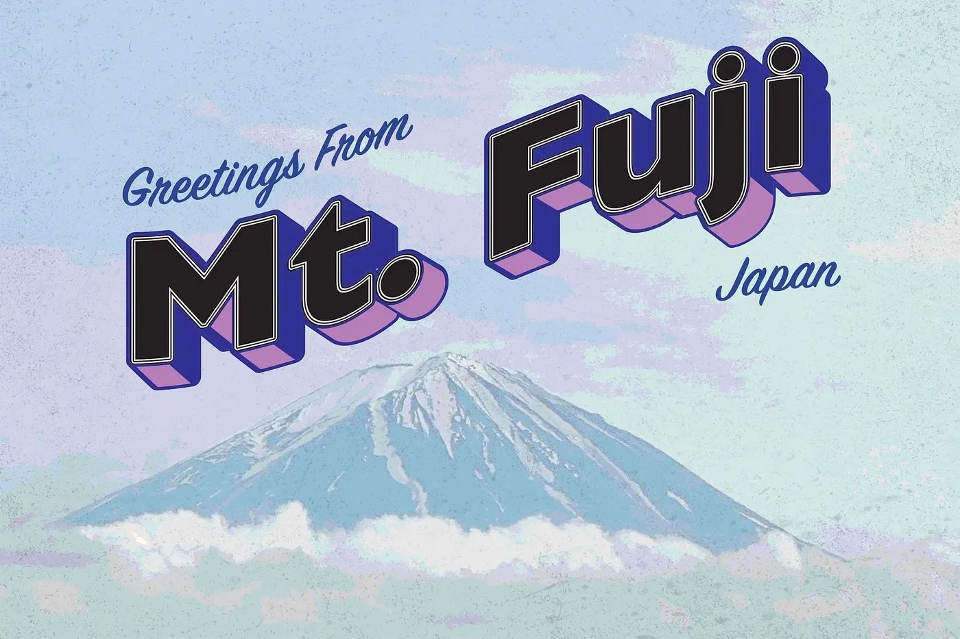
For Project Postcard, I used Photoshop and Illustrator to create a vintage looking postcard of a place of my choice to convey a mood or message. Choosing Mt. Fuji in Japan was a perfect choice for this project because I wanted to convey a certain mood through my work. My goal was to recreate a mood and Japan was such a cultural shock that I decided to go with that focus.
My goal of this project was to utilize different graphic design principles to direct my target audiences attention to the words and vintage background photo. I wanted to show the eerie and ominous vibe of Mt. Fuji and the city around it. Given the cultural feel of the city, I knew it was the perfect place to use for my project postcard.
I chose to use a micro-focus of the actual mountain to convey a general mood of mysteriousness. Mt. Fuji is located in a little town east of Tokyo that is significantly more cultural than most cities in Japan called Fujikawaguchiko. Fujikawaguchiko is home to the famous volcano called Mt. Fuji as well as the infamous Aokigahara Forest which is also known as “suicide forest” or “Sea of Trees”. My goal with the vintage aspect was to give an ominous and eerie vibe in the card. I started using a warm color palette and quickly found that wasn’t the way I wanted to take this. Choosing a cooler color palette can trigger feelings of sadness and indifference but also can create a calming atmosphere that counteracts feelings of anxiety. The town of Fujikawaguchiko is a calm and quiet town surrounding a lake but in the distance you can see the mountain and its surrounding forest at the base knowing it carries a heavy meaning.
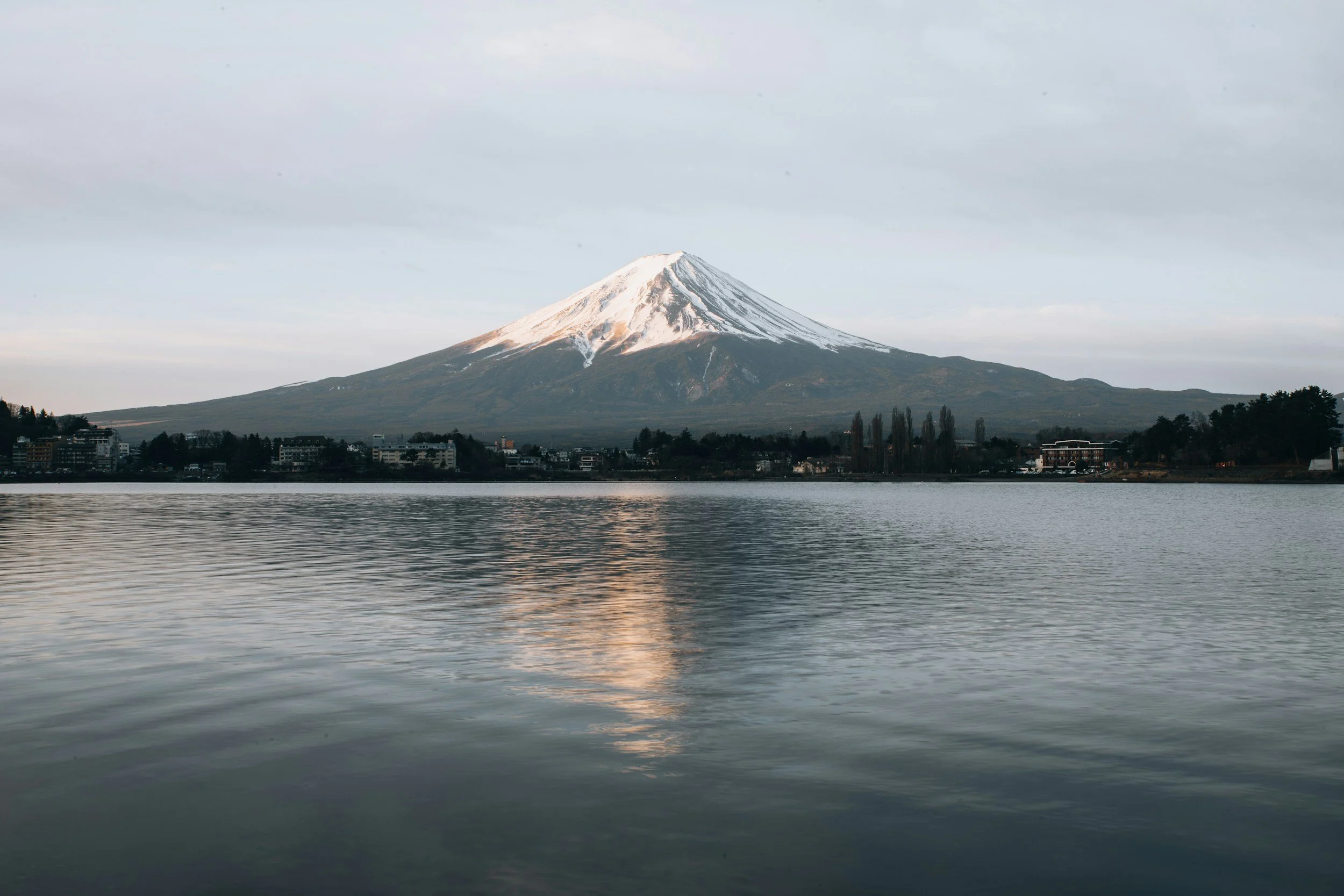
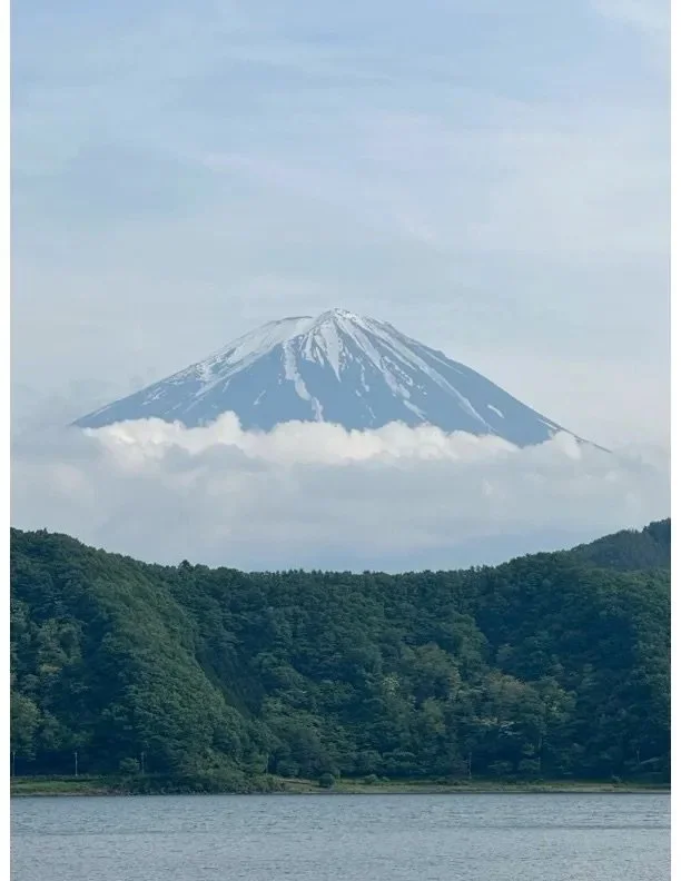
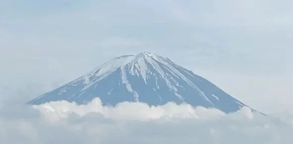
The original photo above shows the forest, lake, mountain, and sky. The clouds at the base of the Mt. Fuji was a lucky catch because it gives some texture to the photo. I wanted to exclude the forest and make the postcard horizontal so I cropped it to the bottom photo. The cropped photo of the mountain alone was a cool photo to get because it is not in a mountain range, it is just a stand-alone mountain because it’s an active volcano. The cropped photo makes the mountain the main point of interest in the photo. The rigid peak was accentuated in the final to show the slope and the snow on top to give the audience an idea of how massive and meaningful it is especially from a distance.
Adding the vintage look was essential to convey the mood I wanted however when it was added, it would bring out colors not seen by the naked eye. For example, purple was brought out in the final product so I used the purple as inspiration for the words. Originally, I used a reddish color to make the words pop but it was the wrong color in the end. Purple won.
To measure the success of the project, I asked multiple of my close friends and family to take a look at it and give feedback before I used the purple in the lettering shadows. Most of the time, they told me it was a great looking vintage card with a primal focus and look except the color was off. After that, I decided to use a purple to match the background and it all blended seamlessly. The main lession I learned was to do my research beforehand. I looked at multiple examples of vintage postcards to create my own vision. However next time, I will think of ideas before researching to make it more my own!


